|
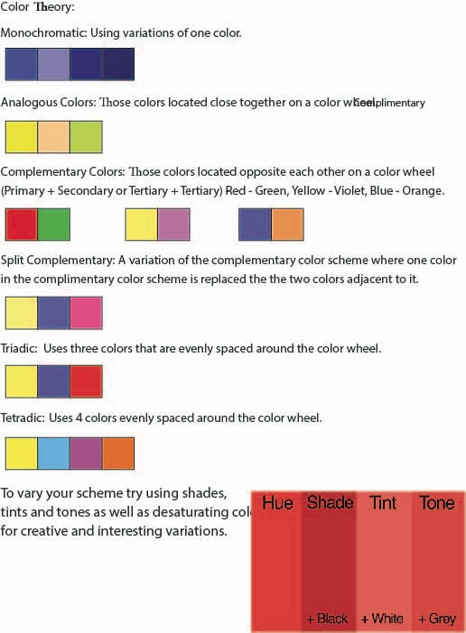
The Twitter logo uses blue and a monochromatic color scheme.  The Google logo used the colors blue, green, yellow and red with a Tetradic color scheme.
 1. Squash and Stretch
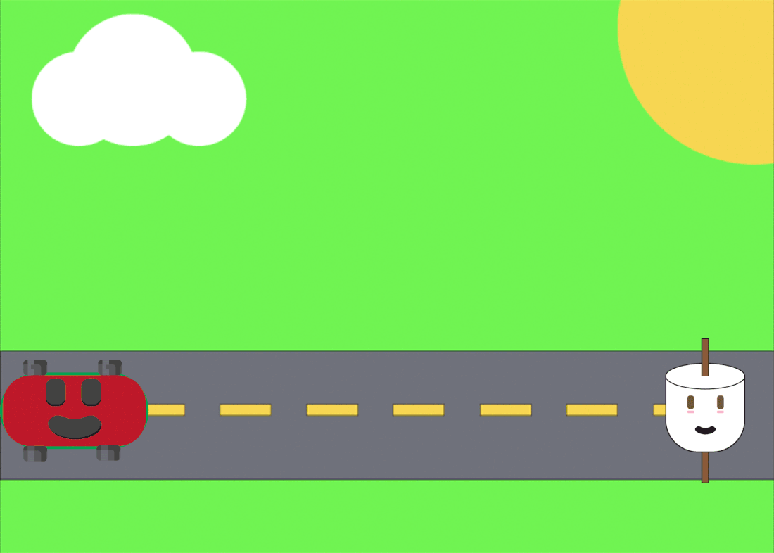
2. Difficult, since it was hard to get the squashing symmetrical using puppet warp and adding a bunch of pins. 3. I like the explosion and opacity change to reveal the message of the animation. 4. I would make the squashing more natural. My obstruction was camping. I had difficulty thinking about what emoji I wanted to put a face on as most camping objects like tents and boots don't exactly have good structures to put a face on. It didn't help that I've never camped before. However, I stumbled upon using a marshmallow from eating smores at one point and decided to settle with marshmallow. I took inspiration from some online sources and was successful in making the emoji have a "cute" look to it. Originally, the design looked more like a cup than a marshmallow so I added a stick to symbolize the camping feeling of the emoji. I could've done better overall by making the arcs in the faces a little better and different from each other.
|
AuthorWrite something about yourself. No need to be fancy, just an overview. Archives
May 2023
Categories |
 RSS Feed
