  1. The purpose is to teach the audience on facts that they may not know or takes a lot of time to research.
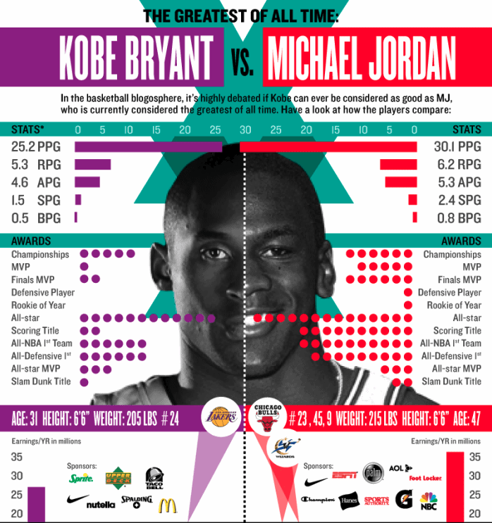
2. Contrast: the different colors show the two different sides Hierarchy: the more important statistics are bigger and my eye sees the colors contrast immediately Accuracy: the information is slightly outdates, but all values vary very little from the shown information in the infographic Relevance: Kobe Bryant and Michael Jordan have been debated by many people on who is the GOAT, so these statistics offer a lot to this debate Truth: information slightly outdated but still offers non-biased statistics 3. Benefits of Mac vs Benefits of Windows Benefits of hardcover textbooks vs Benefits of electronic textbooks Health benefits of gym workout vs athletics
0 Comments
1. Software Engineer - $109020
2. California - 9.3% 3. 24% 4. $6059.70 per month 5. I would have around $2500 per month, taking away around $1000 per month for food that leaves about $1500 for other commodities. 6. Yes. California housing costs are the most expensive thing other than the tax, so I would likely move to Texas as I don't mind humid weather. 7. Roads, parks, libraries, pension, health benefits. 1. My logo reflects me because it symbolizes neutrality and symmetry/balance, since I find myself a calm, collected person who doesn't exactly take certain sides.
2. My favorite part of my logo is the gradient, because I think it makes my logo stand out over other logos that without the gradient, would look plain and boring. 3. One change I made after the critique is removing a lot of unnecessary details that blurred my logo, such as a line separating the name because it was overkill on the balance. 4. Using the 6 thinking hats was difficult because it was hard to focus on all the hats at the same time while creating the logo, but I found it helpful because it taught me how to incorporate each element, some more than others, so I can produce an eye-catching logo. 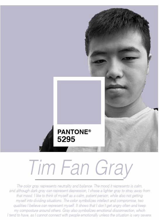 1. Something new I learned were the characteristics of the color gray, mainly that it was a neutral color.
2. I was not surprised as I think most of the characteristics represent me as a person quite well. 3.White-black, as they both symbolize neutrality, and white is more "blank" while black is dark, gray is right in the middle. 4. Pink, as it symbolizes the calmness of the light gray that's present in my pantone. |
AuthorWrite something about yourself. No need to be fancy, just an overview. Archives
May 2023
Categories |
 RSS Feed
