|
My obstruction was camping. I had difficulty thinking about what emoji I wanted to put a face on as most camping objects like tents and boots don't exactly have good structures to put a face on. It didn't help that I've never camped before. However, I stumbled upon using a marshmallow from eating smores at one point and decided to settle with marshmallow. I took inspiration from some online sources and was successful in making the emoji have a "cute" look to it. Originally, the design looked more like a cup than a marshmallow so I added a stick to symbolize the camping feeling of the emoji. I could've done better overall by making the arcs in the faces a little better and different from each other.
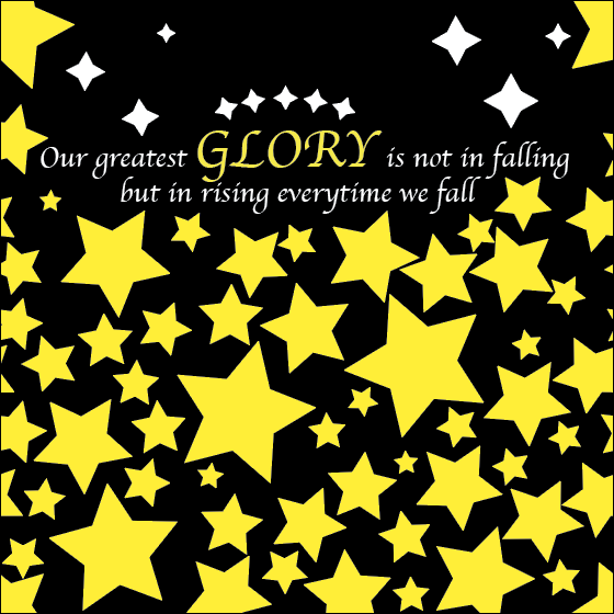 1. I chose this quote because whenever I seem to be at my low, in terms of academics or anything, I try learning off it to not make the same mistakes. Last year for example, I barely landed A's in my classes after having B's most the time, so this year I strove to maintain my grades better.
2. I tried to simulate a stary night with the background and stars, as well as emphasize the word "GLORY" for it to stand out. 3. I would possible make my pattern look better and possibly add a moon or other objects if possible. One thing that inspired me is his story where the building caught on fire.
1. My parents inspire me 2. My friends inspire me 3. My teachers inspire me Men's Tennis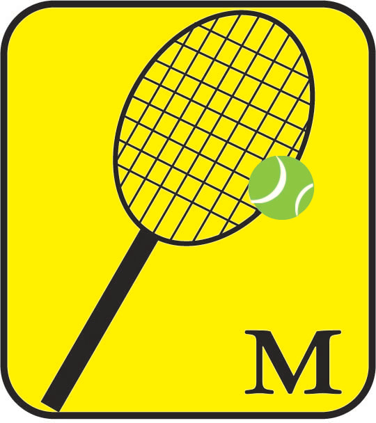 Prior to drawing this on illustrator, I considered many designs, including just drawing the racket or the tennis ball. During the design, I also considered drawing the tennis ball separate from the racket so that it doesn't overlap, but figured it would look better since as seen, it looks as if the tennis ball is getting hit. I also encountered issues with the background, since I merged circles and dealt with overlap to create the stripes on the tennis ball, when I fitted the image into the yellow background, the white circles for the stripes became apparent, so I spent a lot of time with pathfinder to fix it. ChineseIn my design process, I worked with styling the Chinese logo to be based off the word "Chinese" in Chinese. However, I realized that the logo itself might be too complicated and contextually thinking, people who haven't taken Chinese wouldn't understand the logo. Therefore, I went for a more commonly known symbol: Yin and Yang to represent Chinese. Although it may just look like circles stacked on top of each other, I had to use pathfinder to separate the big circle into halves, one black and white, then adding more circles to make it look like what it is now.
|
AuthorWrite something about yourself. No need to be fancy, just an overview. Archives
May 2023
Categories |

 RSS Feed
